Showing posts with label 2 cards or projects. Show all posts

Monday, October 29, 2007

Winter class

I was going to teach a class in October but that fell through. My design was Hallowe'en themed but I was not able to reschedule until November. I might use it next year instead. I used Spooky Spider wheel and Bitty Boos Too, Party Punch, and the tag punch. I used Bordering Blue and So Saffron Cardstock but the Orange patterned paper was from my stash.
I made the fall card while trying to come up with a different idea for the class in November. I used Autumn Fest and Best Friends Alpha in Bravo Burgundy and Always Artichoke. Around here there are still leaves all over the place in November but the card seemed more like September to me so I scrapped that idea.
I decided to go with a winter theme. I was going to avoid Christmas but the Party Punch stamps just seemed to fit. I kept the basic concept but did the peek-a-boo box instead of a scrapbook page. I'm hoping that the girls might be interested in scrapbooking in the future. I have so many ideas. I used Solemn Stillness, Itty Bitty Backgrounds, and Party Punch. I used Whisper White and Night of Navy Cardstock and ink and used some blue paper from my scraps.

Monday, February 05, 2007


I also did a card with this same monochromatic color scheme. I admit I goofed on this one. I really like the look of the card and included the quote because I really liked it. I wasn’t really meaning for it to be a bug or ladybug quote. Now the more I look at it, I think it looks like I wanted an ant image and put a ladybug by mistake or wanted a ladybug quote and put ant in the quote by mistake. Maybe I can fix this by adding a different sentiment in the future. I really like the layout.

Stamps: ladybug by Stampcraft
Paper: red, plaid, whisper white
Ink: Jet black staz-on, black pen

Saturday, February 03, 2007

Stamp Set Saturday


I made these cards for Christmas. They are very quick and simple but look so nice on the glossy cardstock. I stamped the tree in Handsome Hunter and again with Versamark and heat embossed in gold. I used Solemn Stillness.

Stamps: Solemn Stillness
Paper: white glossy cardstock
Ink: Handsome Hunter, Versamark
Extras: Gold embossing powder,


I love this stampset and wanted to try another card that wasn’t for Christmas. There are a lot of winter birthdays in the family so it’s nice to have something wintery that isn’t Christmas. I used Solemn Stillness, Cute Converse for the saying, and stamped the corners with Linen.

Stamps: Solemn Stillness, Cute Converse, and Linen
Paper: Night of navy, Whisper White,
Ink: Night of navy, Whisper White,


Friday, February 02, 2007

Fakey Friday


This was my first attempt at faux linen. The effect is very subtle. I'm not sure if it's because the sandpaper I used was too fine or that my ink pads are all drying up or that I didn't use a darker color ink. I would like to try it again after I get some reinkers and courser sandpaper.

The card I made first to test out the technique and the color scheme. It can be an anniversary card as well but it could also be any other kind of celebration.

Stamps: French Script, wine glasses from Katie& co.

Paper: Bordering Blue cardstock, white glossy cardstock

Ink: Always Artichoke, Bordering Blue, and So Saffron

Extras: ribbon and charm from my miscellaneous stash and have no idea where they came from.

Thursday, February 01, 2007

3D Thursday


I had this purse done in spring papers last year as a prototype for Tasha's Christmas present but I never attached it permanently. Since moisture seeped behind the acetate inside and the patterned paper got stained and warped so I decided to redecorate it and seal it this time. It is a clear caboodles makeup kit that I decorated with patterned paper and a matching pocket calendar. I LOVE the color Brown. It's my favorite color so I couldn't think of a better color to use. I was going to add some more stamping on both projects but thought the flowers from the paper were enough.

Stamps: Letterpress Alphabet. (purse), Brushstroke Alphabet (calendar)
Paper: Patterned paper from Costco
Ink: Chocolate Chip.
Extras: purse and calendar, acetate, mod podge

Friday, January 12, 2007

Fakey Friday


This is a technique that I developed due to my lack of supplies. There might be a technique out there similar already but I’ve never heard of it. I call it faux bleaching. I use white craft ink and blender pens. In the first sample I just colored in the daisy petals with white craft ink using the blender pens. For the second sample I stamped the angel in white craft ink and smudged the image with a blender pen to make the faux bleach background. Once it was dry, I stamped over the white background with black Staz-on and colored with chalk.

Thursday, January 11, 2007

3D Thursday


This year I made some homemade cappuccino for the craft fairs and then later for Christmas presents. Altering the jar was a very easy 3D project. I took a 12x12 sheet of patterned paper and cut 4 12x2 strips. I adhered the strips around the jar with glue dots. Then to make the circle on the top, I took the rim of the lid and traced the inside circle onto another sheet of patterned paper. Then I cut the circles out and adhered to the lid with glue dots. I then made tags with the scraps and tied with hemp.

Wednesday, January 10, 2007

Wednesday’s Words

Cheers to a new year and another chance for us to get it right. - Oprah Winfrey


I really like this quote. It’s so full of hope. We went to bed early this New Year’s Eve and I missed doing my new years resolutions. I still could not skip it entirely. Instead I was a few days late figuring them out (ironically contradicting my first resolution which is to stop procrastinating). What is the point of celebrating a new year without at least attempting to be better, trying to be better, or striving to be better than the previous year. A new chance and a fresh slate is an amazing thing and should be celebrated. Even though most resolutions are rather lofty and unrealistic and soon forgotten, that is not the point. The intention itself is better than nothing at all. Without it there is no hope and no dream of something better. Congratulations to those who are still trying to work on their resolutions.

Here is a card and a 6x6 page using the quote. I’ve never done a New Year’s day card before. It’s usually so soon after sending out Christmas cards, it never even occurred to me to make one. I really like this card so I may do more for next year. This was made from Ballet Blue and Certainly Celery cardstock and ink and some printed paper from my stash. I think I got it at the $1 store but am not certain. I used the sketch from this week’s SCS sketch challenge 106.


The 6x6 page is using the same materials except I added the letter stickers from Basic Grey's Urban Couture collection.

Tuesday, January 09, 2007

Tool Time Tuesday

This is my Stamp-a-ma-jig. I love it. I usually use it to position letters in titles of scrapbook pages. I waited a while to get mine because I focused on getting stamps and paper first. Once I first used it I realized it would have been perfect to have as a beginning stamper. There were so many times I did not ink the stamp properly and threw the image out because it didn’t look good. With the stamp-a-ma-jig, I can reink my stamp and place it in the exact image I stamped the first time. I still use it for that purpose but not as often as I would have if I had it at first. Another way I like to use mine is if I have a stamp that I want to put more than one color on. Usually markers are perfect for that occasion but since I don’t have any markers yet, the stamp-a-ma-jig works just fine.
Here are some projects I made for my best friend Carly who go married last year along with a close up of the stationary and the 4x4 notecards. I used the stamp-a-ma-jig to stamp the rose red and the leaves green on the cards and stationary. I also used it to position the French Script Background since the stationary was larger than the background itself.

Monday, January 08, 2007

Monochromatic Monday


Today for Monochromatic Monday I thought I would show another Christmas present I made. This one I gave to my sister-in-law Tasha. Lavinia loves to get into her shoes and purses. Now that it is complete, I wish I put some pics of Lavinia on it too. When I first thought of making it I thought I would include a pic with her and Lavinia and I just don't have once since Lavinia was a little baby. Now I'm thinking that I still could have put a picture of Lavinia at least. Well, too late now. The case itself is a see through Caboodles make up case. I used pink patterned papers from Costco and Katie& co purse and shoe stamps along with Letterpress Alphabet. I stuffed it with bath products.

Saturday, January 06, 2007

Stamp Set Saturday


My favorite alphabet stamp set is SU Letterpress Alphabet. It's perfect for scrapbooking titles or monogram sets. For Christmas I made two name frames with this set and gave one to Philip and Dawn and the other for Diane and Judson. I forget the company that made the patterned paper. I used Letterpress Alphabet stamps and, French Script, Linen, the swirl from Fun Filled and "merry little christmas" from Cute Converse. The hardware is from the Hodgepodge Hardware. I would like to make some more with the seasons for my house and one for Lavinia's bedroom with her name on it.

Thursday, December 07, 2006

3D Thursday

This is a great holiday idea. I made these holiday Santa, Reindeer, and Snowman soups using a pattern from the Dirty Dozen Gallery on splitcoaststampers.com. It contains a package of hot chocolate some marshmellows and a candy cane and a poem tying it all together. This is a great project for any holiday. I made a pumpkin for Lavinia at Hallowe'en and filled it with candy corn. The designer of these all season treat containers is Leigh O’Brien. Her gallery on the website is amazing and you can see her projects as well on her blog Sunflower Studio. Her all season treat bags are much more ornate than mine. I strive for the ability to create great cards and projects like her. Meanwhile, I will be making more of these treat containers to fill little treats for the kids at Christmas.

Wednesday, December 06, 2006

Wednesday’s Words


“Christmas waves a magic wand over this world, and behold, everything is softer and more beautiful.” - Norman Vincent Peale

I never associated Christmas with peaceful, soft, or beautiful growing up. It was exhausting, stressful, and busy; but still exiting and enjoyable. We put up the tree, bought and wrapped presents, put up the lights, decorated, unwrapped presents, went visiting all in the same week. Christmas day we were all together and Boxing Day I saw my cousins, uncles and aunts at a get together at my grandparents. Although I loved Christmas Day and seeing everyone on Boxing Day the stress of getting everything ready for Christmas had everyone exhausted before it even began. Because of this I looked forward to Christmas but at the same time dreaded it. Once I was married, we decorated the first day we both had off in December. That was the first Christmas I really enjoyed. We had our presents done in early December and listening to Christmas music while wrapping presents really helped to bring on the Christmas mood. I even baked for Christmas that year. We had fun at Mom and Dad’s on Christmas Day and enjoyed Boxing Day as well. Ever since, we were prepared early and had a peaceful and enjoyable holiday season … until this year. We still hope to have a peaceful and enjoyable holiday season, but we are a little behind in the holiday preparations. We are decorating next week either on Thursday or Friday. It’s still the first week of December so we still have time to be ready so we can relax during the holidays.

Tuesday, December 05, 2006

Tool Time Tuesday


This is my double circle punch by Creative Memories. It makes 1¼-inch and 1½-inch circles. I love that it is two punches in one. I mainly use it for scrapbooking but did need it for Lavinia’s birthday card last year. I got the idea for the ladybug from splitcoaststampers but can’t find who came up with the idea in the first place. I used the sketch from the catalogue last year on page 101 using Say Something Mice. I thought it was a great sketch to use a lot of scraps. The wings spread to reveal the word bliss stamped underneath. I really liked it so I made a few more. They are great to use together for a framed affect like I did in Lavinia’s park page or combined with different shaped circles in Lavinia’s Bubbles page. In the Big Sister heritage page I used the punches for framing but also used it to make a paper tag. Of coarse any 1¼ and 1½ circle punch will do but I find it so handy to have both tools in one. Usually when I use one I use the other too and it illuminates so much searching through my messy pile of goodies.
Monday, December 04, 2006

Monochromatic Monday


Here is a quick card with a monochromatic color scheme. I love using patterned paper with monochromatic cards because it is the simplest way to add interest. This card is 3.5 x 6 so that it fits in a regular envelope. It is the perfect size for a money holder card.

Saturday, December 02, 2006

Stamp Set Saturday


This is a retired SU stamp set called Heavenly Heralds. I chose this set to use for my Christmas cards this year. The first card had the fold in the middle. I used the French Script background, masked the circle and stamped the first word from the sentement inside. I used the Poppin' Pastels technique for the main image and used the sketch from Splitcoaststampers sketch challenge 67.
The second card was using the sketch from last year's idea book. It was using a different stampset but I like how it worked with this one too. This was a really quick and easy card.

The third card was done using the bleaching technique. I have tried before to stamp with bleach but, especially with a stamp as detailed as this, it never turned out right. There were spots that were really bold and others did not change color at all. I gave up on bleaching until we did this kind of bleaching technique at our stamp club meeting. In this card I embossed the image in gold then applied bleach with a Q-tip filling in the image.
The last card I did with a blue marker and pencil crayons. I highlighted the dress with the blue marker then used the blender pen to color it in. The rest of the image, I used pencil crayons. I hope to get the watercolor wonder crayons soon. Right now I am limited in coloring mediums. I know the blender pens and classic ink work but I only have one family in classic right now. I still use what I have so I can create and practice for better mediums in the future.
This is only one of the angels in the set. The other angel in the set is picking flowers and goes with the quote, “The love of beautiful things is heavenly homesickness.” I do like the quote but for what kind of card would you use it? I would use it in a card to someone who gardens or scrapbooks. (We all know every scrapbooker has their stash of pretty things.) In that case, I wouldn’t use the angel. Other than someone who collects angels, I really have no ideas. Even so, I do love the set because of the Christmas angel and quote and have often used the other two stamps alone.

Friday, December 01, 2006

Fakey Friday


One of my favorite faux techniques is faux metal tags. I love hardware and the look of metal on my scrapbook pages and cards. Basically you make a faux metal tag out of cardstock and metallic embossing powder. I emboss the whole piece of paper and do three coats of EP. While it is still hot stamp on it with a dry rubber stamp. I stamped the tag with small lettering so I only did two coats of EP. It’s a really fun and easy technique. If you’ve never tried it there is a tutorial on Splitcoaststampers.com. I also made this card for this week’s splitcoaststampers’ card sketch challenge (SC100).
Stamps: flip flops, Cute converse, Fun Filled (spiral and swirls backgrounds)
Paper: generic cardstock
Ink: black Staze on, whisper White, Versamark
Accessories: gold EP, White fiber
Techniques: faux metal tags

Tuesday, November 07, 2006

Tool Time Tuesday


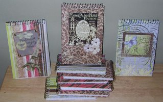
My latest purchase of scrapbooking supplies was spent on this product - the Crop-a-dile. Actually I was down to the end of my customer card at the local scrapbook store so I had $20 off any product. This baby only cost me just under $10 CAN. Great buy. To me, it is definitely worth the $30 at full price. It has a 1/8 and 3/16 punch on each side and an eyelet/snap setter. I admit I love the hammer. I really like to bang out those eyelets and not be constricted by how close it is to the edge. Silent setters never interested me in the slightest. Well I thought that if I bought this thing I should try it out. Since I am going through adhesive like crazy I thought I would save some and attatch my main image on the covered notebook on the right with eyelets. Since I adhered the eyelets before covering the notebook cover the desired area were not too close to the end of the page and it was a bit cumbersome for that reason. The actual attaching of the eyelet was very easy on both the eyelets and my hands. I do prefer the hammering method but would definitely use my cropadile if the desired area were close to the edge or if I can not hammer because Lavinia is asleep. The great news is that I did not buy this product for the setter though. Last year I went through a number of punches making paper bag books and this year I broke another punch while making my covered notebooks for the craft fair. I had heard that the Cropadile was made for heavy-duty use so I decided that after spending way over $30 in punches that had broken and trips to the scrapbook store to get them, the Cropadile would be worth trying. With my covered notebooks, I added chipboard to the front and back and because of my previous punches limitations I would have to punch all separately and the pressure would reek havoc on my hands. I knew this was the product for me once I used the punch the first time. It went through the paper cardstock, and chipboard with ease. It says that you can even use it on tin. I have not tried but I do believe that you could. I made all of these mini covered notebooks (stacked in the pic) and 3 large notebooks in one evening. Before having the cropadile I would do two notebooks in one evening. I recommend this product to anyone making mini-books and covered notebooks. If you only make cards or scrapbook pages unless you are really into silent setters, I would stick to a good quality punch.

Monday, November 06, 2006

Monochromatic Monday

Monochromatic colors are all the hues of one color. For scrapbooking the warms colors look great with sepia tones and the cool colors look great with cool tones. I will use this effect on my pages mostly when I have great embellishments that I love on the page, but they seem to overpower the pictures. Using monochromatic tones reduces their power. It could also be used to create a peaceful effect. Here are some of my projects using a green monochromatic color scheme.

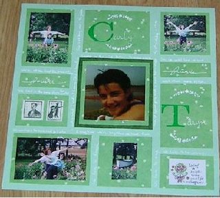
This was another page done during the last VSBN. It was done for the Ireland challenge, which was to complete a layout in monochromatic green while following the sketch.
Journaling reads: Carly and I met at Canoe Cove Christian Camp in the mid '80s. We saw each other only once a year but wrote often. Once we could drive we saw each other more often. Throughout time we often lived far from each other. But we lived in the same dorm for 6 months. We worked in the same mall for 6 months. We love to laugh. We love to sing. We love to be crazy. This is us being crazy in the garden. My 16th birthday Aug 27,1991. Stamps: Noteworthy Paper: $ store patterned paper, green cardstock Ink: Whisper White, White Souffle pen Accessories: Vintage clip art, sticker quote, Monogram Rub ons Techniques: blocking

I made this cardset for the craft fair. There is 2 of each design. I used Reverse Prints (now retired) and Noteworthy (also retired). I also made a notebook with matching pen. I’m still not sure if I will sell together or separately so people have the option to mix and match. All papers were from my miscellaneous paper pile so I am not aware of the manufacturer I used Glorious Green Ink.


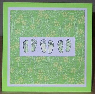
This is a 4 ½ x 4 ½ card The stamp is Katie&co. and the papers were again from my miscellaneous paper pile. I used Jet Black Staze on ink.

The color is off in these cards. They are more green than they seem. I used the poinsetta image from Happiest of Holidays. I used Old Olive ink and a black Zig pen for faux stitching.